Search for health services

Project mission
Redesign the search for medical services in the app and website of the largest health insurance company in the country to improve user experience and satisfaction, and to reduce the number of complaints at the call center about current usability issues.
Business requirements
Tools
Miro
Figma
Google Tools
Team
3 UX/UI Designers
1 Designer Thinker
My roles
UX/UI Designer
UX Researcher
Design Thinker
Facilitador
Dead-line
8 weeks:
Research/Analysis: 2
Ideation/Prototyping: 3
Tests and report: 1
Planning and processes
I believe that Design Thinking does not need to be used in every project, but in this specific one, this way of thinking helped a lot to plan all the stages within the set timeframe, selecting and separating based on the schedule each method and tool most suitable to be applied in each phase. if you want to skip to the UI Results click here.

Immersion
In the Immersion phase, the project team delved into the context of the problem through Benchmarking and interviews with stakeholders. Different points of view were considered, both from Bradesco Seguros employees and from insured and uninsured individuals, in order to gain empathy and identify challenges and opportunities, broadening the team's perspective on the challenge.
51 interviews
27 internals
24 with users
Benchmarking
16 western and eastern references
15 main features mapped
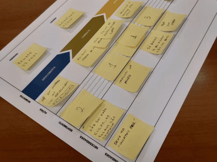
AS-IS Mapping
Mapping the journey and the main pains and needs.
Card sorting
Adjusted method for understanding the ideal journey and each usage scenario.
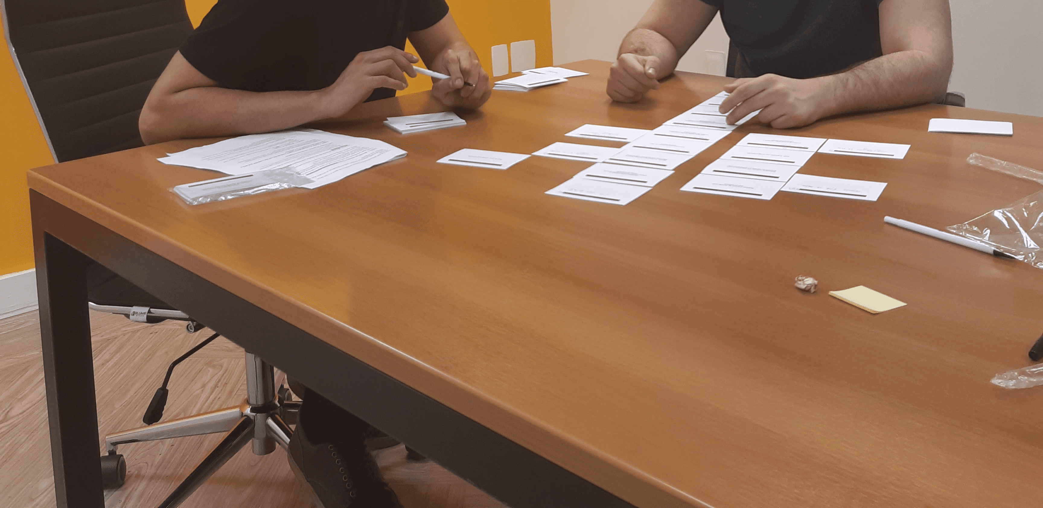
Analysis
440+ quotes
Who went through the debriefing process in Excel and clustering in Miro.
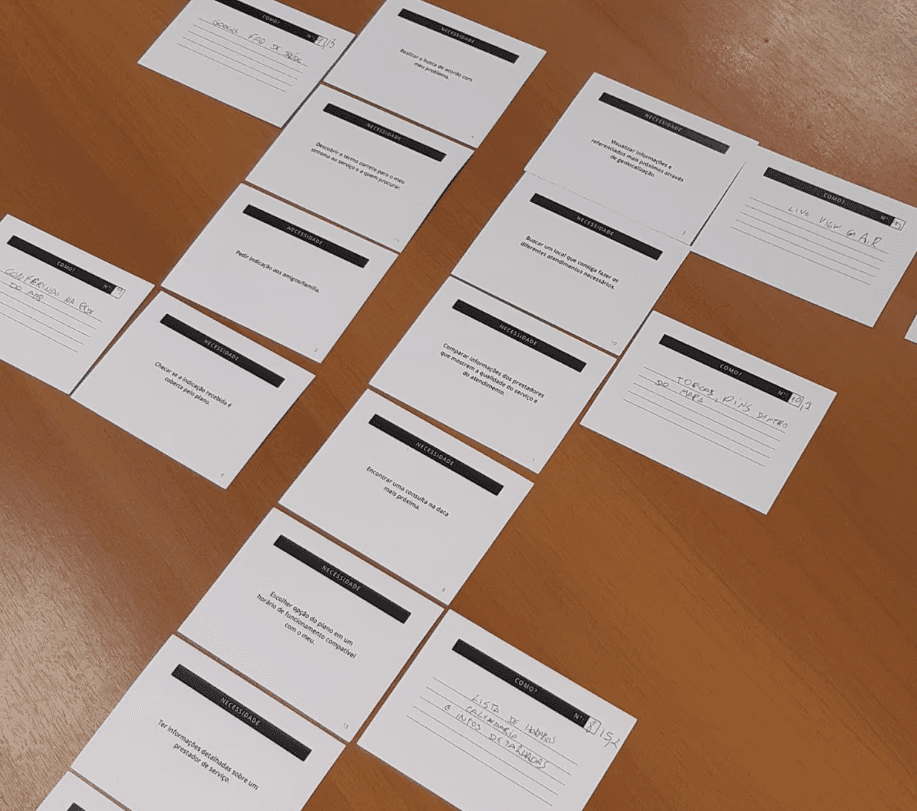
25 findings
They were conceived through the clusters made with all the collected inputs.
13 cross-projects
internally mapped to understand and integrate the current project with those that were ongoing or in the roadmap.

Ideation
In this stage, the results of the analysis were used to build the ideal journey, its scenarios, and each step necessary to define the experience tailored to each need and situation. After this ideation, I facilitated an in-person prioritization workshop with the departments to determine which features would be prioritized, deprioritized, and discarded. This workshop was based on a part of the Lean Inception framework, which allowed for the prioritization and direction of each feature in a roadmap through waves and sprints.
Ideal journey
Building a flexible and comprehensive journey for every user need.
Scenarios
Addressing 4 possible scenarios for use in the app or website for each type of situation and urgency.
End-to-end
defined from the discovery of the problem to the "post-consultation", encompassing both digital and analog strategies.
Prototyping
Sitemapping
Generated considering all the scenarios and flows defined as MVP in the workshop.
Sketchs
Made on paper and pen to organize the information and functionalities of each screen.
181 screens produced
131 in mobile version
50 in desktop version
Tests and validations
22 user tests
They were made with collaborators and users in the defined persona. Some insights were important to adjust accessibility, especially for older people.
SUS validation
The users filled out the SUS (System Usability Scale) questionnaire, and it thus became clear with numbers the improvement in the experience delivered compared to the previous one in production.
Results
30 mapped features
10 of them were prioritized and planned in the roadmap.
1 journey / 4 scenarios
Considering from the beginning of the case beyond the digital, to the post-use, encompassing the entire service.
2 prototypes
Being one in the mobile version and another in the desktop version.
Report document with 180+
documentation and guidance pages for the company, the product, and the project.
Reduction of 28%
In the amount of calls to the customer service center, KR is essential for product performance.


Agendamento online